Pull up a chart of almost anything — a currency pair, a stock, gold, it doesn’t matter — and zoom out far enough, and you’ll notice something. Price doesn’t wander around at random. It moves in a rhythm: a stretch where it pushes hard in one direction, then a stretch where it pulls back, then it pushes again. Zoom in closer and the same rhythm shows up on a smaller scale, tucked inside the bigger one.
That rhythm has a name. It’s called Elliott Wave Theory, and once you learn to see it, you start noticing it everywhere — which is both useful and a little bit addictive, if we’re honest.
A stockbroker and accountant named Ralph Nelson Elliott first wrote it down in the 1930s, after years spent going through decades of stock market data. What he found wasn’t a formula for predicting the future. It was closer to a map of how crowds of people, trading together, tend to push prices around. Fear, greed, hope, panic — they show up in patterns, because human psychology hasn’t really changed from one generation of traders to the next.
Let’s go through what those patterns actually look like, because “wave theory” sounds abstract right up until you see it broken down piece by piece.
Every Market Move Has Two Phases
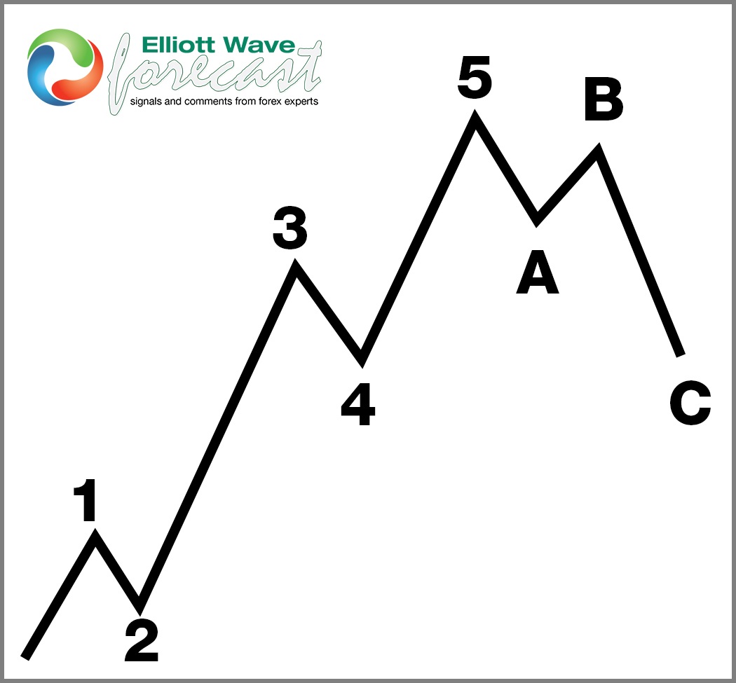
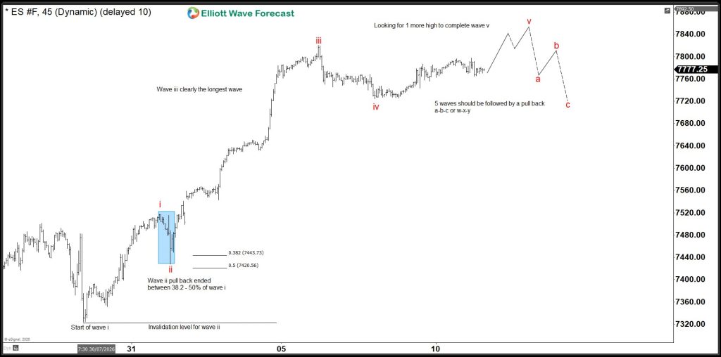
At the most basic level, Elliott noticed price action breaks down into two kinds of movement. An impulse is a move that goes with the bigger trend, built from 5 smaller waves. A correction is a move against that trend, built from 3 smaller waves.
That’s really the whole theory in one sentence: five waves one way, three waves the other way, repeating at every scale you care to look at. The hard part isn’t remembering that rule — it’s training your eye to actually spot it on a live, messy chart. That takes practice, and honestly, a fair number of wrong guesses along the way. Nobody skips that part.
Breaking Down the 5-Wave Impulse
Inside an impulse, each of the five waves has its own personality. Waves 1, 3, and 5 move with the trend. Waves 2 and 4 are the pullbacks in between.
Wave 1 is usually the toughest to trust while it’s happening. It often just looks like a bounce, so a lot of traders assume it’s noise inside a bigger downtrend and miss the start of what turns into a real move.
Wave 2 pulls back, sometimes sharply, and this is where doubt creeps in. It can retrace a big chunk of wave 1, enough to make you wonder if wave 1 meant anything at all. There is one rule worth remembering here: wave 2 can pull back a long way, but it can’t fall below where wave 1 started. If it does, the count is wrong — simple as that, no exceptions.
Wave 3 is where things usually get obvious, and it’s typically the longest, strongest wave of the five. It’s also the wave most new traders regret not holding, because it often looks “too extended to chase” right up until it keeps going anyway.
Wave 4 is another pullback, usually shallower and choppier than wave 2. It tests patience more than conviction — it can drag sideways in a way that tempts you to exit early, right before the final push starts.
Wave 5 is that final push. It isn’t always as strong as wave 3, and sometimes it’s noticeably weaker — a pattern called a truncated fifth, which is its own topic for another day. Wave 5 is also where a lot of latecomers pile in, right before the correction begins and catches them off guard.
Breaking Down the 3-Wave Correction
Once the impulse finishes, price doesn’t simply reverse in a straight line — it corrects in its own 3-wave structure, usually labeled A, B, and C.
Wave A is the first leg against the trend. A lot of people mistake this for “the trend reversing,” which is exactly the kind of assumption that gets traders into trouble early.
Wave B is a bounce against wave A, and it can be deceptively strong — strong enough to convince people the old trend is back, right before wave C proves them wrong.
Wave C finishes the correction and can move fast. Once it’s done, the market is usually ready to pick back up the bigger trend it was in before the correction started.
Corrections don’t all look the same, either — there are a few different shapes they can take, and mixing them up is one of the more common ways a beginner misreads a chart. That’s a big enough topic to deserve its own article, so we’ll leave it there for now.
Waves Within Waves: Why the Pattern Is Fractal
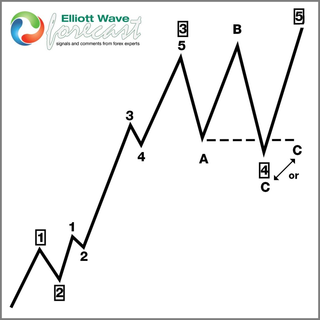
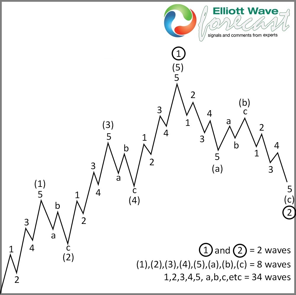
Here’s the part that tends to make it click for people. Every wave we just walked through isn’t really one solid move — it’s built out of smaller waves of the same 5-3 pattern, one degree down. Wave 1 of a bigger impulse is itself a 5-wave impulse when you zoom into it. Wave 2 is itself a 3-wave correction. This keeps going, smaller and smaller, all the way down to whatever timeframe you’re trading.
This is what people mean when they call Elliott Wave “fractal.” It’s also why the same chart can look completely different depending on which timeframe you’re looking at — a move that’s wave 2 on the daily chart might look like a complete wave 1 through 5 on the 1-hour chart. Neither view is wrong. They’re just describing the same price action at different zoom levels, and learning to hold both in your head at once is a big part of what separates a beginner from someone who’s been doing this a while.
A Quick Example of How This Looks in Practice
Say a market has been falling for weeks and then starts to rally. Wave 1 up might not look like much — just a bounce inside what still feels like a downtrend, and plenty of traders will call it exactly that and fade it. Then comes wave 2, a pullback that retraces a good portion of that bounce, which seems to confirm everyone’s suspicion that the downtrend is back in control. As long as that pullback holds above the low set before wave 1 began, the structure is still intact.
What happens next is usually the giveaway. If price turns back up and starts moving faster and further than the first bounce did, that’s wave 3 announcing itself — and it’s exactly the moment most people who dismissed wave 1 as noise end up chasing the move late, at worse prices, out of frustration. This is precisely why the early waves matter so much to get right: by the time wave 3 is obvious to everyone, a good chunk of the move is already behind you.
Why Any of This Matters if You Actually Want to Trade
Here’s the thing — none of the above is worth much if it stays purely academic. The real value of Elliott Wave, for someone actually putting money on the line, is that it gives you a way to work out roughly where you are inside a move, and just as importantly, roughly where you’d be wrong.
That second part is the one people gloss over, and it’s the one that actually matters. If you know a count is invalid the moment price crosses a specific level, you’ve got a real risk plan instead of a hope. That’s the idea behind what we call a Blue Box: a zone where the wave structure, combined with some Fibonacci math, tells you roughly where a turn is likely — and just as clearly, where you were wrong if price pushes straight through it instead. It turns a vague feeling (“this looks like it might turn around here”) into an actual line in the sand.
The Mistakes Almost Everyone Makes Starting Out
A few things trip up nearly every beginner, so it’s worth naming them now instead of letting you find out the hard way.
The biggest one is forcing a count to match what you already believe. If you’re convinced a market is going up, it’s tempting to label every wiggle in a way that supports that belief. That’s backwards — the count is supposed to tell you what’s likely, not confirm what you already wanted to see.
The second is treating every wave the same. Wave 3 and wave 5 are not equally reliable, and trading them with the same size or the same confidence is a good way to give back money you didn’t need to.
The third is skipping the invalidation level entirely — jumping into a trade because “it looks like a good setup” without ever pinning down the specific price where you’d admit you were wrong. That one habit alone probably causes more damage than everything else on this list combined.
How Long This Actually Takes to Feel Comfortable With
Worth being honest about this too: nobody reads one article and starts counting waves confidently the next day. Most traders we’ve talked to describe a stretch of several months where the rules make logical sense on paper but still feel shaky in real time, especially during choppy, sideways stretches where even experienced analysts disagree. That’s normal, not a sign you’re doing something wrong. The traders who stick with it tend to be the ones who accept early on that a wrong count isn’t a failure — it’s just part of how you get better at reading the next one.
A Quick Recap, If You Want the Short Version
In case you skimmed and landed here: markets move in a repeating 5-wave push followed by a 3-wave pullback, at every scale you look at. The five-wave push has its own internal rules — wave 2 can’t erase all of wave 1, wave 3 is never the shortest, and wave 4 shouldn’t overlap wave 1 in a clean impulse. The pullback afterward can take a few different shapes, which is a topic on its own. And the entire point of learning any of this isn’t to win an argument about labeling — it’s to know roughly where you are in a move and exactly where you’d be proven wrong, which is the closest thing to a genuine edge that any chart-reading method can honestly offer.
Where This Leaves You
If you’ve made it this far, you now have more working knowledge of Elliott Wave than most people who’ve been trading for years without ever sitting down to learn the structure properly. That’s not a knock on them — most people learn indicators first and structure never, which is a bit backwards, in our opinion.
From here, the next useful thing to understand is the difference between Elliott Wave’s actual rules — the ones that never bend — and its guidelines, the ones that are usually true but not always. Mixing those two up is where most of the “this stuff is too subjective” complaints come from, and it’s worth untangling on its own.
In the meantime, if you want to see how all of this looks applied to live markets rather than just diagrams, that’s exactly what we do every day across 78 instruments — forex pairs, indices, crypto, commodities — labeling the waves in real time and marking the zones where we think the next turn is likely. If you’d like a free next step, grab our beginner’s guide to Forex trading — it’s a good companion to everything covered here, and it won’t cost you anything to try.