To be kind, it’s been quite a challenging couple of months for the emotional health of all of us, including traders.
There’s been state sponsored attempted cover-up of a murder that could threaten the geo-political environment depending upon what the strong hand of the U.S. considers toward a so called “ally”, world record lottery jackpots in the U.S, pipe bombs mailed to politicians, The Twitterer in Chief going after the FED, multiple 300++ point swings (sometimes in the same day or session) in the major indices, great earnings reports that get shorted, one of the most intense hurricanes on record hitting the U.S., Brexit go and a no go then a go again and now who knows, mid-term election fiascos, apocalyptic California wildfires, and I could go on and on. Based on all the aforementioned one would think we’re heading toward the end especially with regards to the volatility in the markets. The markets are no doubt jittery with every single rally having very weak hands. There is a smell of panic mode in the air.
I’ve traded for a while now and I can still tell you that one of the hardest things to do is be calm while the masses are puking with panic. This is especially true when your analysis tells you to be looking the opposite direction of the manic herd behavior. The old saying of ‘buying when there’s blood in the streets’ is definitely easier said than done. But, if you, like me, have developed a system of what to do when these times come then you’ll be better off than the herd when all the dust settles and the hind-sighters appear saying they were with you all along.
A different perspective.
We’re going to look at something a little different (for us anyway) in this blog and get away from our normal Elliott wave inspired analysis and look back at history for some perspective. Today we’re going to look at price momentum in terms of Relative Strength and how it relates to the past compared to where we are right now in the SPX coupled with our proprietary Sequence Report. If you watch and listen to the financial news talking heads on tv or print the common theme asserted seems to be driving impressions through emotional headlines or special “segments” when a correction or rally has been underway for quite some time. But, how do you, as a private investor or trader, know when to really pay attention so to speak or just ignore the sensationalism as I do 98% of the time. So what’s one simple way of ascertaining if we’re truly in some entrenched bear market or simply a correction? One way is utilizing certain aspects of the RSI.
The Relative Strength Index – RSI is a momentum indicator that measures the degree in magnitude of the recent price changes to be able to analyze “overbought” and “oversold” conditional analysis. Traditional interpretation of the RSI states that if the RSI value is above 70 then the instrument being analyzed is considered becoming “overbought” and one would use that information to look to reverse the uptrend. Inversely, a reading of RSI of 30 or below is regularly interpreted as indicating an “undersold” situation within a particular instrument. The RSI is calculated using the formula: RSI=100-100/(1+RS) . RS = the average gain of up periods during the specified time frame divided by the average loss of down periods during the same specified time. The default specified time frame for comparing these up periods to down periods is 14. But, here at EWF, we prefer to use 13 as it relates to our cycle analysis better being that it is a number in the Fibonacci sequence which has significance within the process of our models of growth and regression. That’s a whole other topic we’ll save for another blog.
The Problem with RSI.
The problem with using the RSI as an independent determinant of a particular instrument’s direction and change in trend is that sudden large price movements can create false “buy” or “sell” signals in the RSI as the Index can remain above or below the specified “extreme” triggering levels for a considerable amount of time. This would leave one just holding on for hope that the instrument reverses before they run out of capital in their trading account to cover the drawdown. In the aforementioned statement we’re assuming the trader is using this simple method of selling at the overbought signal and buying at the oversold signal level without sound risk management.
At EWF we use RSI as well, but as you will see if you accept the invitation into our world, it’s not in the traditional sense. RSI should be used as a complement to your analytical methodology and not the sole reason to make any decision to risk capital. In fact, we don’t use the overbought or oversold levels at all. Our method is centered on using RSI trend line analysis with notations of divergence to determine when a particular cycle has ended or a pivot level has lost support well before the price action would overtake said level. It reads a lot more complicated than it is and I invite you to join us to learn how you can intertwine Elliott wave, RSI, and our Cycle and Sequence Analysis to trade on the correct side of the market in terms of direction over 80% of the time. So while you’re contemplating on trying our service for free. I’ll throw in another freebie perspective below.
Some Free but Valuable Insight.
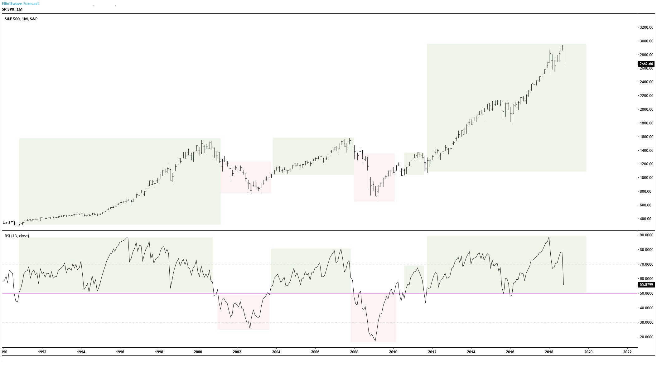
In the chart below we show a very simple interpretation of the SPX on a monthly basis. That seemingly small move down at the end of the price action was at the time of printing the month of October 2018. Doesn’t look like much compared to where we’ve been, does it? But, from the headlines nearly every day you’d think we were already in another depression or financial crisis. In the chart you’ll see something that’s rare in these days of instant gratification or disappointment and that’s a broad perspective. Look at the RSI underneath the chart’s price action and notice the horizontal line colored fuchsia/pink at the 50.00 level. RSI at 50 represents neutrality or “the line in the sand” between the bulls and bears so to speak. On a monthly basis the market’s natural trend is very clearly to the upside or bullish. The bullish times going back in this chart to the early 1990s are highlighted in light green and the downturns or bearish times are highlighted in light red. What you can see is that while the RSI is above 50 the price action remains entrenched in a bullish trend and while below 50 we see periods of significant bearishness. This helps to give the trader an edge on bias from a Macro level to look for confirmations to go long while above 50 in the RSI and confirmations to go short or cover longs when the RSI reads below 50.
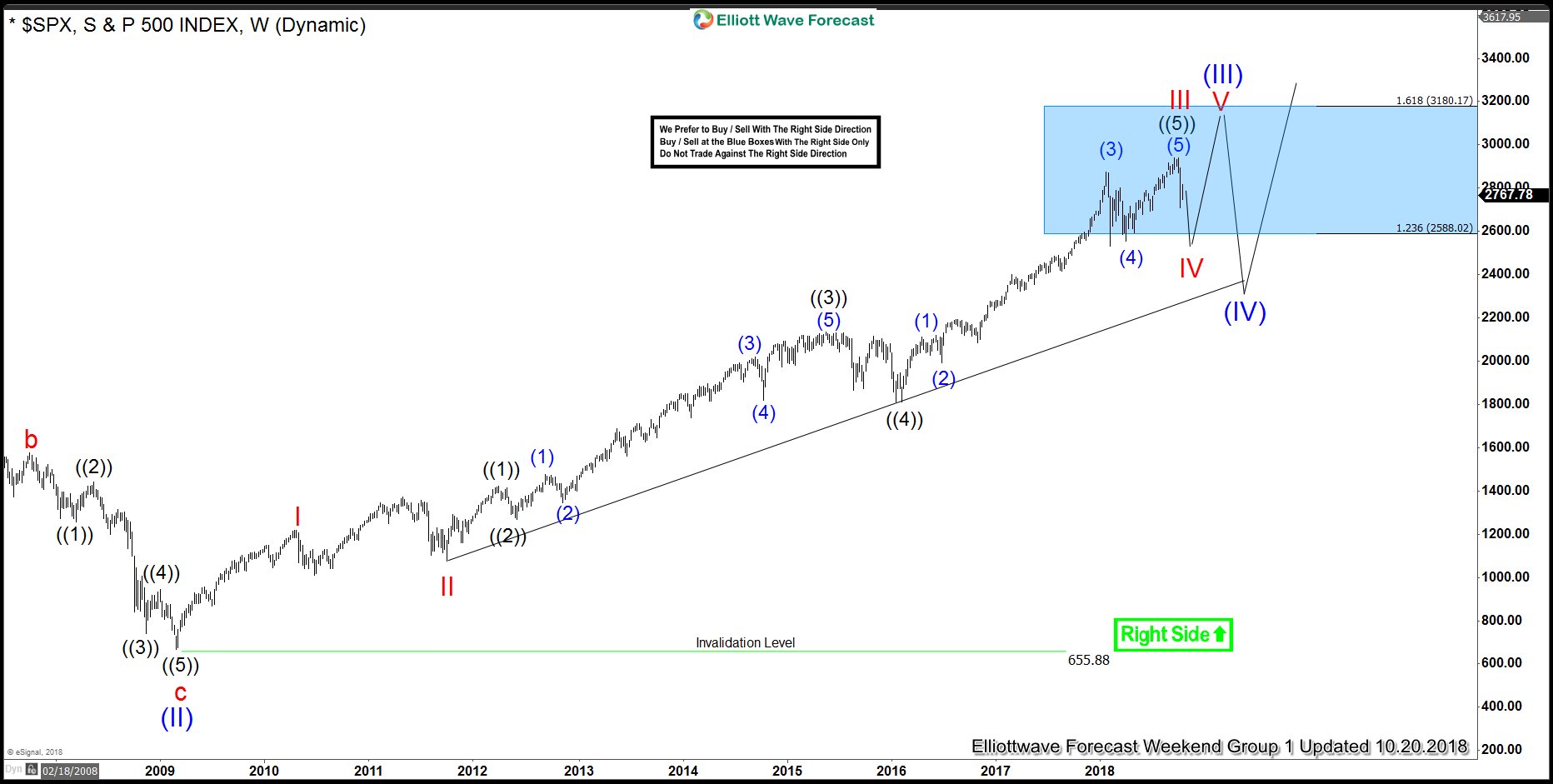
So, for now, as you can see at the far right of the chart above we’re still in bullish biased territory on the monthly time frame and would take a much more relative move down compared to what we’ve already witnessed this month to change this trend. This couples well with our overall view that the market is simply correcting the cycle that ended on September 21, 2018 in the weekly chart below. While this chart below has now been updated with greater precision the idea still remains the same and the monthly RSI still supports further upside for now.
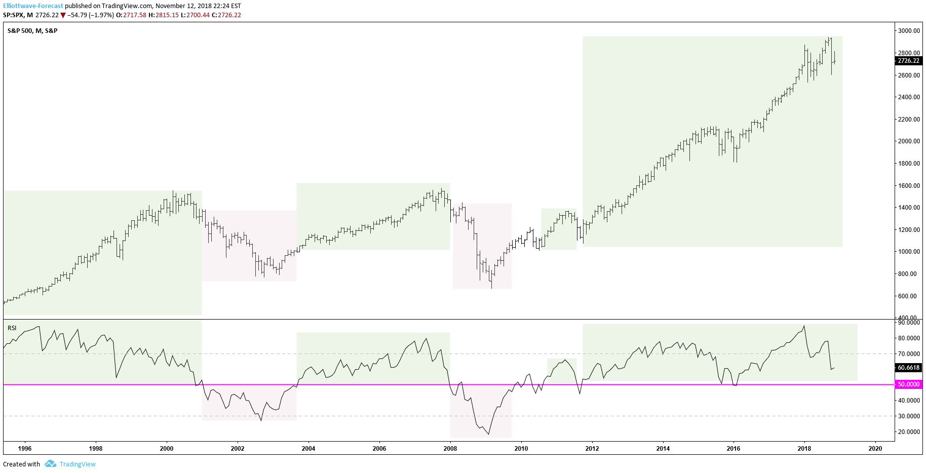
To update this simple analytical view I wanted to show you what the Monthly chart of SPX looks like now after a big down day in the broader market indexes. The RSI is still holding up well above the 50 level and is starting to “hook” up after the bounce seen in the first few days of November. The lows put in at the end of October continue to hold for now. There will come a time when the market is blazing with bearishness again similar to what we saw in 2000 and 2008/9. Is that time now?
So, is the sky falling? We say, emphatically not yet. To add to that our non-biased process tells us there’s quite a bit (over a year) more upside before we get to the extreme levels of the Super Cycle top. That may sound like smug contrarianism, but our method is sound with time stamped documented analysis. Our research team does this day in and day out all the way down to the hour time frame to provide our subscribers with consistent and accurate market insight. I’m not trying to leave you hanging here on purpose but to fully understand our process it would take more than this very simple blog. Take a peek underneath the hood of Elliottwave-Forecast.com with absolutely no risk for 2 weeks. Wishing you nothing but success as you navigate these choppy waters of Mr. Market.
James Tipton
EWF Analytical Team
Back


