The aftermath of the 2008 financial crisis saw a massive deleveraging and repricing of risky assets, forcing many central banks in the world to adopt near-zero interest rate and in some cases introduce unconventional monetary policy like quantitative easing.
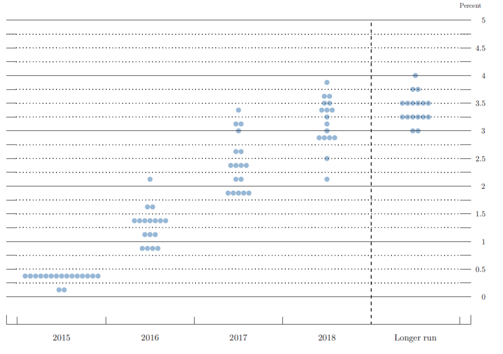
Fast forward to 2016 today, after 7 years of near-zero interest rate policy, the Federal Reserve finally raised the short-term interest rate in December 2015 and thus began the period of tightening cycle. At the last Fed meeting in December, majority of Fed members expect 4 more rate hikes in 2016 (to 1.5% target fed funds rate), as can be seen from the Fed dot plot chart below:
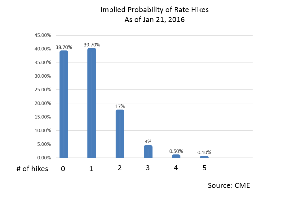
However, lately bets against FOMC dot plot (i.e. against FOMC own rate forecast) gained traction after some worse-than-expected U.S. data. NY Empire State Manufacturing in particular is singled out with a -19.37 actual vs -4.00 forecast. The worse-than-expected data from U.S., together with global equities selloff, China’s risk of slowing down, and also persistent weakness in oil and other commodities see the Fed Funds Future assigning only 0.5% probability for 4 more rate hikes in 2016.
As of 01/21/2016, Fed Funds Future assigns 39.7% probability of a single hike in 2016, just marginally higher than no hike probability at 38.7%. In other words, despite FOMC members saying 4 more hikes are expected in 2016 per the last Fed dot plot, market participants believe the Fed either won’t raise rate further or will raise rate only 1 more time this year. Below is the latest Fed Funds Future from CME
Regardless whether the Fed will hike further or not and how many times, common perception seems to suggest that as interest rate starts to rise, risky assets like equities should see further pressure lower. Observation from the past tightening cycle however suggests it’s not the case, especially at the initial stage of the tightening cycle. Although each tightening cycle is unique and different in a way, historical precedence does have some value when we try to predict the unknown future.
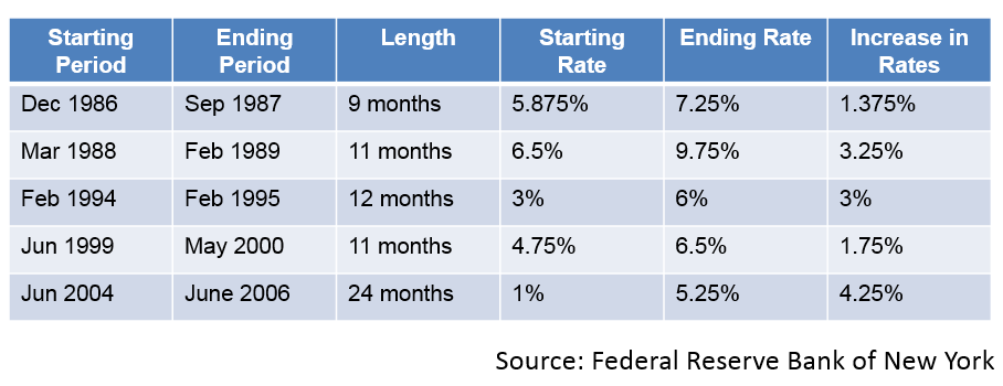
Below we take a look at the 5 previous periods of tightening cycle when the Fed started to raise short term interest rate:
From the table above, with the exception of 2004, duration of the tightening cycle is pretty fast, almost all within 1 year with an average rate increase of 2.7%.
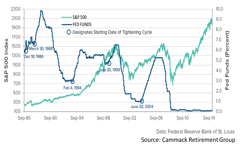
Chart below shows the Fed Funds Rate overlaid with S&P 500, and first glance at the chart suggest that the initial tightening cycle does not affect equities negatively overall.
It’s however accurate to say that the immediate short-term reaction from equities to the first rate hike in the tightening cycle is lower. Table below shows the degree of equities correction as well as the duration immediately after the first rate hike in the previous tightening cycles.
From the table above, the average percentage of equities correction is 8.82% and the average duration is 2.5 months. At the time this blog is written, we are so far into the 1st month after the initial rate hike at December 16, 2015, and S&P has corrected 14.4% as of Jan 21, 2016.
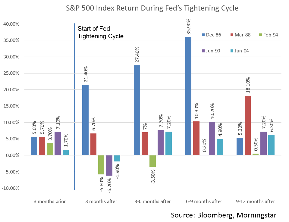
Despite the negative short term reaction of equities to the first rate hike, the more interesting observation from the past tightening cycles is the equities performance 1 year after the first rate hike, which shows a net positive gain as the chart below shows
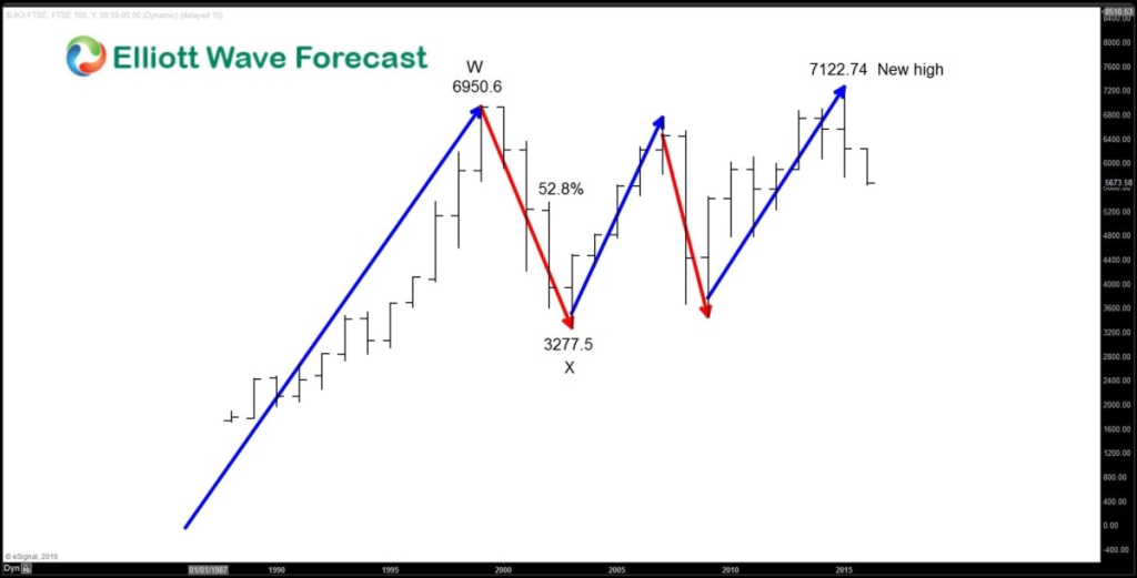
Notwithstanding that each period of tightening is unique with their own macro outlook, if we look at the history of the previous 5 tightening cycles, we can see that equities are doing just fine. The current strong selloff in equities understandably start to make people question about the severity and whether we will see a big crash like 2008 or even worse. A look at the FTSE long term yearly chart below should give a better perspective
From the chart above, FTSE had the biggest correction from 1999 – 2003, losing 52.8% of its value from the high to the low. From 2003 low, it started a new bullish rally in 3 swing, reaching another high in April 2015. The high in April 2015 is 7122.74, which is an all-time high for the Index. From Elliottwave point of view, this suggests that FTSE remains a buy in the dips against 2003 pivot in the first degree and against the pivot at all time lows in the second degree (in case the Index does a FLAT).
For more technical and trading ideas, check our Chart of The Day, Live Trading Room, or take our FREE 14 Day Trial. We provide Elliott Wave chart in 4 different time frames, up to 4 times a day update in 1 hour chart, two live sessions by our expert analysts, 24 hour chat room moderated by our expert analysts, market overview, and much more! With our expert team at your side to provide you with all the timely and accurate analysis, you will never be left in the dark and you can concentrate more on the actual trading and making profits.
Back